Monday, January 17, 2011

A Whimsical Boarding Pass

This boarding pass had a fun and whimsical design incorporated with fuschia and orange.   Christie and James originally went with a teal and sand palette, but then realized that these colors weren't as vibrant and eye catching as they wanted.  Christie quickly emailed me back and decided bright and bold is the way to go with a destination wedding.  Pre-addressed envelopes to coordinate with font and color were added to complete the look.  A big thanks to Christie and James!

Saturday, January 15, 2011

Swirly Boarding Pass

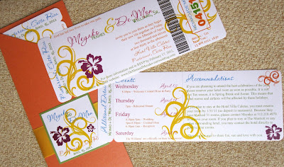
This boarding pass was so much fun to design.  Meyako called me one afternoon while waiting at the airport and surfing the internet for the perfect boarding pass.  After she had emailed a few potential stationery designers, she was in a bind.  A couple didn't answer her emails, a couple didn't return her phone calls and one that did return her phone call sounded frantic and couldn't find the time to give her the info she needed.  Well, needless to say, Meyako did leave me a message and I returned her phone call and after a quick conversation (as she was about to board a plane), I went to work designing some unique.  In her info email, she wrote wanted a little of purple, orange, yellow, green, and turquoise.  Also, she wanted something not too beachy but just a hint.  So I designed boarding pass with whimsical swirls and added a hibiscus flower for just the touch of beach.  I emailed the design over and she couldn't wait to see the actual sample in the mail.  We were a match made in heaven!  Thank you to Meyako and De'Mon for choosing me to design your wedding invites.  The pleasure was all mine!

Monday, January 10, 2011

Humor in Love

I loved designing this boarding pass.  When I met with Sherry and Ron, I instantly fell in love with their humor.  They wanted to put their personality into their boarding pass invitations and what better way to do that than putting a "ball and chain with game over" on the front.  Guests' will open the envelopes and laugh and immediately think, "This is so them!"  Thanks to Mai Dang of Honeydew Events for introducing us.  It was great designing something humorous and fun!

Friday, January 7, 2011

Winter Tulips

When Gigi and Jason met with me a few months ago, they knew for sure they wanted something with yellow and grays.  This color combo is awesome!  Gigi wasn't sure what theme she wanted to go with but after looking at a few samples, tulips was the winner.  Instead of using the custom response card and response envelope, Gigi and Jason decided on saving with postage by using a response postcard.  Also keeping in theme with the color scheme, we also used a dark gray envelope and enhanced with a wrapped address band for sophistication.  I love it!